Neufund 1.0
A fundraising platform built on blockchain.
Service
Brand design
Industry
Fintech
Client
Neufund
Date
2019

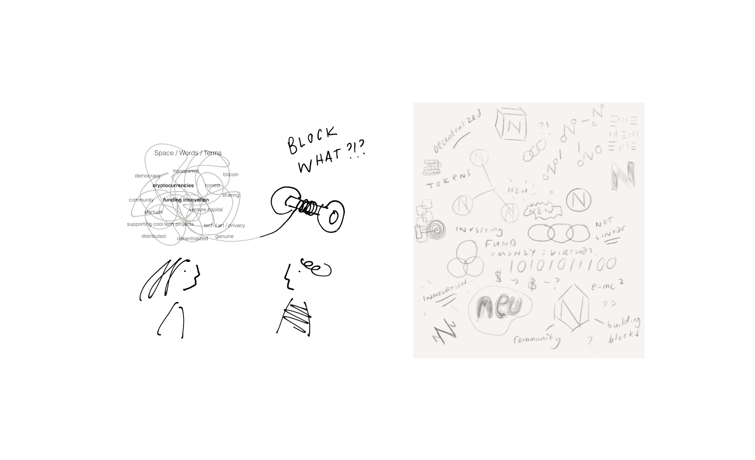
The Challenge To create a Corporate Identity that represents a new fundraising platform built on Blockchain. The logo needed to represent the properties of Blockchain and decentralisation, but also very complex technology. At the same time it also had to resonate with a community of developers representing and being active in this space.
The Solution After some research, I decided on the hexagon shape as a base. It represented a perfect mathematical equation, a language spoken by bees across the world, always with the same outcome, the same ‘language’, the same goal. The hexagon represents this universal language spoken far and wide - for me this represented decentralization & technology quite succinctly. Busy bees also represented Blockchains proof of work concept.
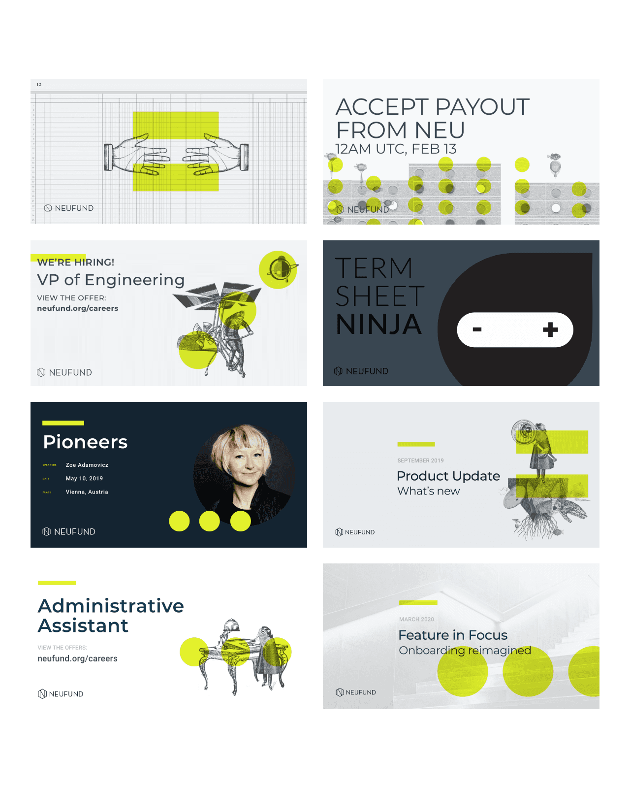

A visual image library was created to help tell a story of a fish out of water, in a dystopian world. These visuals supported abstract concepts across various communications channels for marketing, social media, business development and the product.
When Neufund launched, we wanted to convey that it was in new, uncharted waters. By changing the way that people could fund and companies could get funded, daring to go where no-one dared to go before, behold the “fish-human” characters were born.
At the time competing companies were dark and mysterious, and the community and target audience identified with this. Hence the visuals of fish-humans and a dystopian world that was created.


Neufund announced its closure in January 2022. Read more about it here.


